Athenahealth: Patient Scheduling
Project: Patient Scheduling Mobile WebApp
Target User: Patients of our clients
Project goal: Drive patient demand to practices by providing patients with a simple way to book appointments online.
Role: UX, research, strategy
We found that our users were hitting major roadblocks with the current patient portal and scheduling product. Utilizing our research we streamlined the process fro a patient to book an appointment and provided evidence to our providers that patient could be trusted with their care.
Results: The product launched in May of 2018, and we saw steady growth with our alpha clients. As we improved functionality and launched various campaigns we increase our average weekly bookings from 10 to +700 in the first year.
Workflow
Our partners
Research/Strategy
Data and Research Driven Product Direction
As a new product with few key enterprise level collaborators we knew from past experience that we could be easily swayed by the whims of our clients and the opinions of the few. We were likely to not achieve statistical significance for awhile, so we made sure not to bend at every wind to avoid crippling feature creep this early in a products development. So we did our best to gather as many opinions as possible, and capture as much data as possible to prove our hypothesis right or wrong and to provide as much sound reasoning to any choices we made. We luckily had a wealth of experience in failure in the scheduling arena at athena that we had a good idea our initial direction.
Competitive analysis
We worked to understand the options a potential patient has when booking appointments. We wanted to learn, and see where we could gain a competitive edge.
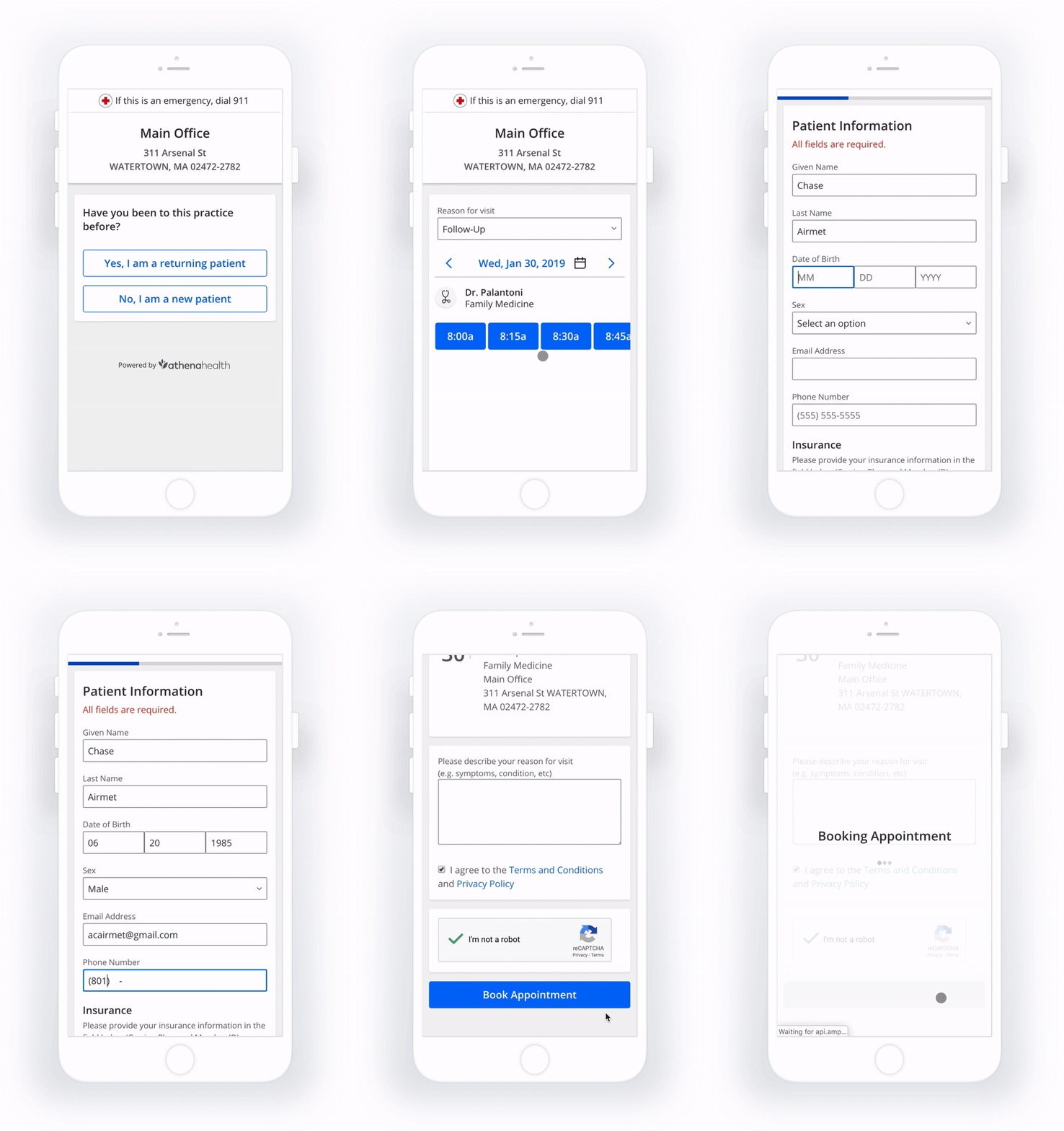
The workflow is one of the areas we were able to improve upon. Today every booking product requires you to create a account or log in order to book care. We don’t, instead patients are treated as guests, and then in the background we connect existing patients to their records. In the campaign workflow users need to only verify their identity and then can quickly book without the need to input additional information.
Patient Scheduling Heuristic score, a score of +3 is ideal
Heuristic review
We used Nielsen’s 10 heuristics to gather a quality score for the patient scheduling product. Many products have a score and this gave us a quick way to identity problems within our application and to see how we measured up to the other products at athena.
To get a score we created a Video of the typical patient experience, then had other coworkers score it according to the ten heuristics on a scale of 0-4. With the list of issues created by the workshop we then sized and prioritized the list to see what we could do in the short term to affect the overall experience of the product.
User behavior tracking
We built in from the very beginning the ability to track the users actions so that we could learn from our users behaviors, and to keep an eye on the system status. We have used this information to inform strategic and design decisions, to prove or disprove assumptions, and to set goals of ways to improve the product.
Minimum Feature Set Story Mapping
As we planned out the future and wanted to size to determine the viability of our prospective directions we did a series of Minimum Feature Sets that we could then take those narrowed tasks to our development team so we could get an idea of the amount of effort it would take to create the next iteration on our product.
In the exercise you capture through a journey map all of the steps in the workflow. Then all the features/requirements that could be built are captured below that, and finally you make a line to identify the must have elements.
Qualitative and Quantitative Survey
The process at athena to connect with patients for research doesn’t exist. To build this out I have been working with the design operations team to make a patient panel. I have also worked closely with the other patient-facing teams to share resources.
Because of these limitations I have done my own guerilla research and have had many unstructured conversations with those I come in contact with. I have also queried the non-PHI data from our booked appointments like the visit reason, insurance field, and notes field to learn from what patients are saying.
Additionally I put a experience survey at the end of the product to give patients a anonymous place to rate and share their experience. Roughly 10% of all our users take this survey. I am currently in the process of coding this information so I can present a comprehensive view of how our product did in 2018. I will post those results here when they are complete.
Design
Continual Improvement
When I started on the team we already had a product 8 months in the making. I think it is hard as a designer to come into a project and not want to change everything, but I work under the guideline that without evidence or strong logic a change shouldn’t be made. So I sought to incrementally improve the product and prepare it for production. As we moved forward the following changes, iterations, plans were made, and problems dealt with. Below you will see many of those improvements that have happened or are in the pipeline.
Campaign Workflow
Just in time for the flu season we got our campaign workflow up and running and had a few alpha campaigns. This workflow differed because we already would know the patients, the appointment type, and the provider they would see. So the patient would only need to verify their identity (again without logging in) and then pick a time to book without the need to gather demographic information.
Insurance
Earlier research indicated that the most important information to a patient booking was weather or not their insurance is accepted at the practice. We had connected with athena’s insurance directory to help users search for the accepted insurances. This data quickly proved unusable for a patient facing product due to its complexity so a quick solution was put in place of an open text field for patients to manually input their insurance data.
Design System
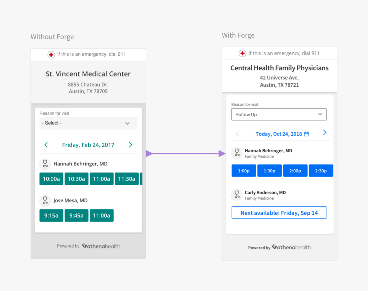
Originally athena had a design guideline but each team was responsible for its implementation. About 2 years ago we created a new system meant to eventually be used by everyone called Forge. Because this was a design initiative I worked to sell the team on switching to the new system. It was a big technical lift so as an interim solution we adjusted to the look and feel of Forge by changing the colors and typeface. We are currently in the processes of shifting completely over to Forge.
We also found that the interaction Blue color didn’t meet our strict WCAG 2.0 AA accessibility standards that a patient-facing product needs to have so I worked with the Forge team, and have many times since to adjust colors.
Gender Diversity and Inclusion
I am currently pushing to include optional fields in the patient information page that are inclusive to gender diversity.
Outcome
This product will be combined in early 2019 with the practice scheduling product. In 2019 the goal is take over the existing Portal scheduling experience, integrate with the automated wellness outreach, and the care management as a service application.


